
How Kaleidoscope Charter School Reimagined its Future by Re-envisioning its Brand
So Much More than a Logo…Part 2
Kaleidoscope Public Charter Schools was looking for an edge to set themselves apart from neighboring public and private schools. They knew they needed a clear, consistent message and image—something that would resonate with parents in their target audience and was true to their program offering and unique style and personality.
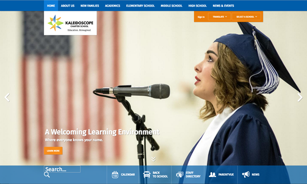
MP+G redesigned a dynamic, visually eye-catching, user-friendly website for Kaleidoscope’s three schools: high school, middle and elementary.
They embarked on a brand strategy process that refreshed not only their entire look but provided insight and clarity into who they were and how they wanted to grow. Their brand process helped define what types of students they wanted to attract and what staffing they needed to accomplish their goals. It allowed them to leave behind programming and thought processes that were not in alignment and to focus on areas that reinforced their brand promise. In short, they were able to reimagine the education they wanted to offer, who they wanted to be, and how they wanted to be perceived.
“The brand strategy process helped our administration team define who we are and what differentiates us from other school districts. Through the process we got to know what makes us unique in the educational marketplace—developing a brand strategy and identity that truly reflects our personality,” said Brett Wedlund, former Executive Director, Kaleidoscope Charter School.

New Kaleidoscope Charter Schools district logo

Before
By Mary Pat McNeil, MP+G Marketing Solutions – building resilient brands ™
*First published in Minnesota School Boards Association Journal March–April 2021